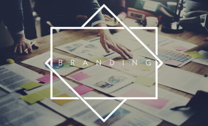
When designing a business logo, you want to create something timeless. You want to create something that reflects your brand and the values that your company holds dear.
No matter how much effort you put into creating a logo design that will last for ages, you will need to tweak the logo now and then to keep up with the changes in design trends. This is something that we see with even some of the most well-known brands on the planet. The basic design of their logo may stay the same, but some of the minor characteristics change to reflect what modern sensibilities of local design.
Let’s take a look at some of the local trends for 2019 and see how they might impact your future logo design.
2019 – 2029 Is the Decade of Bright Colors
According to Voodoo Neon Signs – the Number #1 Neon Sign seller in the US – 2019 to 2029 (as predicted in many sci-fi thrillers) is the decade of bright colours and tight clothing. Think, Tron and Blade Runner if you want to validate this! “Everyone predicted bright colours and tight clothing – from books to movies!” says Christine from Voodoo. We think she’s right.
Vibrant combinations of eye-catching colours have been trending for the past few years, and it continues to be the trend into 2019 and beyond. Bright colours are flexible and can be used with several brands. The nice thing about these colours is the way that they can influence the viewer’s emotions. Bright colors on their own are not enough to make a powerful logo, but when they are interlaced with traditional local design principles as well as some of the other trends we are going to discuss, they have their place.
Most logo designers are staying away from 3-D colourful logos. They are opting for flat logos. This is a trend that has become a bedrock principle of logo design. A flat, brightly coloured custom logo neon sign will still represent a company’s brand well if it must be reduced to black and white.
Geometric Logo Designs
Geometric logos have been a mainstay of local design. Logos are designed to be symbolic or to represent some characteristic of the business. In the world of geometry, shapes have meanings. For example, when a person sees a triangle, they think of strength. A circle could engender feelings of completeness and eternity. A square represents stability.
One of the reasons why geometric logos are so popular now is because geometric shapes can easily be used to represent a simplified version of a more complex figure. This is good in logo design because logos are small but need to be readily identifiable or read. Geometric logos can capture a brand’s essence in a way that can be more memorable than a complex design.
Minimalist Logo Designs Are Here to Stay
We will continue to see the creation of minimalist logo designs. When you search for how to make a logo online, you are presented with several guides that teach minimalism.
The popularity of minimalist logos stems from an understanding of what a logo is designed to do. Logos should be memorable and simple. Think about the logos that you readily identify in your everyday life. It could be a simple swoosh or a bitten piece of fruit, yet it stays with you.
Companies want their logo to be recognized immediately, and they want people to be able to interpret the logo right away. An overly complicated logo does not achieve those goals. Minimalist local designs represent a leaning on the part of graphic designers toward restraint. It is a trend that leads toward a focus on simplicity and taking advantage of the elements that already exist, for example, in negative space. Doing this allows you to design a memorable and recognizable logo that conveys your brand in an uncluttered manner.
Creative Logotypes Creating Art with Words
Creative logotypes, while not new, have gained traction in recent years. A creative logotype uniquely and memorably spells out a company or brand’s name.
A notable subset involves using illustrations as letter substitutes. These illustrations not only evoke the letter they replace but also add significance to the overall logo design.
The Growing Popularity of Semi-Flat Logos
Consider enhancing your logo by imparting a three-dimensional feel. Many logos now seem to hover above the page. The appeal of semi-flat logos partly stems from their striking appearance online.
Designers achieve this pseudo-3-D effect by employing gradient colours, crafting shadows, and leveraging various angles. This trend, particularly prevalent in the tech sector, suggests modernity, relevance, and swift adaptability.
When crafting a lasting logo for your business, avoid mere fads. However, periodically reviewing your logo against current trends can be beneficial. After all, an outdated logo can negatively impact perceptions of your business.
10 Steps To Designing A Logo For Your Business
There is a lot to think about when you’re designing a logo. Here are 10 steps to set out the process you can follow.
1. Define Your Brand Identity
Begin by deeply understanding what your business represents and aims to achieve. Think about the core values, mission, and the audience you serve. These elements should guide your logo’s design, influencing choices from colours to shapes and symbols. Consider using a mood board to visually compile your ideas and inspirations. This early conceptual work is crucial as it lays the foundation for your logo’s aesthetics and helps ensure it resonates with your desired demographic.
2. Research Your Industry
Spend time investigating the logos of competitors and industry leaders. This will help you identify common themes and elements that are well-received in the market, and perhaps more importantly, opportunities for differentiation. Analyzing what is already out there helps prevent unintentional imitation and can inspire you to think outside the box. This step ensures your logo not only fits industry standards but also stands out from the competition.
3. Brainstorm Ideas
Generate a wide range of ideas and sketch them out, no matter how preliminary they might seem. Free-form brainstorming, whether through doodling, word associations, or digital sketches, can spark creative breakthroughs that lead to a unique logo. It’s important to create a diverse array of concepts before narrowing your focus. This step encourages creativity and broad thinking, which is essential to developing a unique brand symbol.
4. Choose Your Design Style
Decide on a specific design style that encapsulates your brand’s essence. Whether it’s a minimalist design that conveys modernity or a detailed emblem that reflects tradition, your style choice should align with your brand’s identity and appeal to your target audience. This decision will guide the finer details of your logo such as complexity, colour scheme, and typography, making it crucial for cohesive brand representation.
5. Select Colors Carefully
Colours play a significant role in perception and can evoke specific emotions in your audience. Choose a palette that supports the psychology of your brand message. For instance, blue can evoke trust and dependability, while green might be used for its connotations with health and sustainability. Consider cultural colour meanings and visibility against various backgrounds, especially for digital media. This consideration is vital for ensuring your logo communicates effectively across different mediums and contexts.
6. Pick the Right Typography
Typography should not only complement the visual aesthetic of your logo but also reinforce the character of your brand. Whether you choose a robust serif font to suggest authority and tradition, or a sleek sans-serif for a clean, modern look, ensure readability across sizes and formats. Custom fonts can offer exclusivity but require careful design to maintain clarity and functionality in all uses.
7. Create Vector Graphics
Utilizing vector graphics software like Adobe Illustrator allows your logo to be scalable without loss of quality, which is crucial for applications ranging from business cards to billboards. This step involves careful plotting of every line and curve in your logo, ensuring that it can be reproduced in any size. Vectors are pivotal for maintaining consistency in your brand’s visual representation across all marketing materials.
8. Get Feedback
After developing initial designs, present them to a focus group that represents your target audience. Feedback is invaluable as it provides insights into the emotional and cognitive reactions of potential customers. Adjust your designs based on this feedback to enhance appeal and effectiveness. This iterative process helps refine your logo into a polished, market-tested representation of your brand.
9. Finalize Your Logo
Choose the strongest concept from your designs and refine it into your final logo. Make meticulous adjustments to balance, colour, and form to ensure the design is both aesthetically pleasing and functionally sound. This final version should not only capture the essence of your brand but also be versatile enough to work across various media and applications.
10. Protect Your Design
Once your logo is complete, consider legally protecting it through a trademark. This prevents other businesses from using a similar design and solidifies the logo as your official brand mark. Consulting with a legal expert can help navigate the complexities of trademark registration and ensure your logo is protected under intellectual property laws. This final step is crucial for securing your brand identity in the marketplace.